Data structure
How data arrangement affects visualization
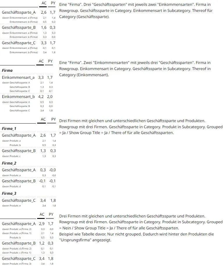
The way data is mapped into the data structure has a major influence on how it is later visualized in the Workbench. To illustrate, three differently structured datasets (loading spreadsheet) and the resulting visualizations are shown.
To demonstrate the structuring, the fields “company”, “business divisions”, and “income type” or “products” are each mapped differently onto the columns rowgroup, category, and subcategory. The variations below are visualized using tables.